The Palme d’Or winner at Cannes, ‘Anatomy of a Fall’, finished with DaVinci Resolve Studio
Nominated in five Oscar categories and winner of the Palme d’Or at the Cannes Film Festival, ‘Anatomy of a Fall’, Blackmagic Design‘s DaVinci Resolve Studio was used to finish this gripping family drama that unveils the shocking implosion of an ordinary family.
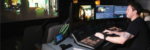
Directed by Justine Triet, her fourth feature film paints a dizzying portrait of a woman accused of murdering her husband, set against a suffocating backdrop. Graded at M141 with DaVinci Resolve Studio, colorist Magali Léonard of Chroma Shapers goes behind the scenes of her work on this film, discussing the artistic and technical challenges.
“Justine and Director of Photography (DP) Simon Beaufils contacted me early on during the camera tests, prior to the commencement of filming. I had previously collaborated on the grade for Justine’s film Sibyl, for which Simon also lensed. This project marked my second collaboration with Justine and my sixth with Simon,” Léonard explains.
Director and DP were involved throughout picture finishing, and thanks to this close collaboration and dialogue, Léonard was able to translate the film’s singular atmosphere into the grade. “It was a stimulating and exciting process,” she reveals.
The Vision Translated
imperfections and blemishes, creating something carnal and sensual. This vision was particularly prominent in the trial scenes, characterized by flushed skin tones, perspiration, and palpable exhaustion.
“I channeled that and Simon’s direction into the visuals, paying particular attention to the faces and skin tones. We collaborated closely in establishing a look, starting with extensive camera tests during preproduction involving hair, makeup and costumes,” says Léonard.
In the early stages of the project, Beaufils shot tests on 2 perf 35mm film so that Léonard could get close to how film looked when calibrating the digital camera tests. “This served as our foundation to find the film’s mood and visual identity,” she noted.
Triet and Beaufils opted for a large format camera with Hawk V lite anamorphic lenses, despite the film’s aspect ratio of 1.85, reveals Léonard. “The anamorphic lenses brought a richness of colors, flares and unique blurs to help soften the sensor’s digital sharpness. Simon was fantastic to collaborate with, crafting beautiful images which conveyed complex emotions,” she continues.
“My approach to the visuals was iterative, playing with contrast using DaVinci Resolve’s custom curves, and then colors, saturation and highlights. I’d then add grain to create a more pronounced look, which we applied from the rushes onward, giving us a good basis for the film’s general mood,” says Léonard.
Fine Tuning and Collaboration
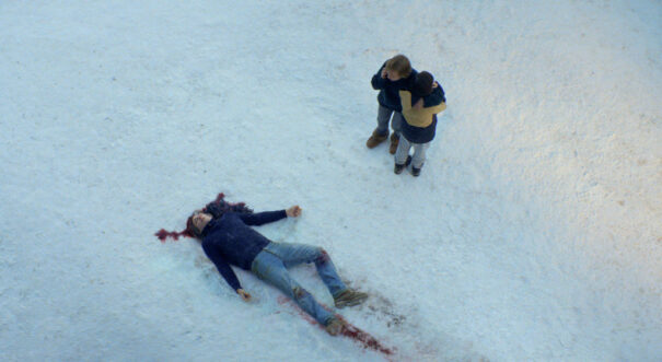
In the later stages of the DI, Léonard returned to the nodes used to establish the look to finetune her work. “I ventured into bolder suggestions, working to nuance the highlights and specular lights while adding subtle diffusion. For example, we pushed the saturation in the blues while retaining a rawness present in the set design and costumes,” she explains.
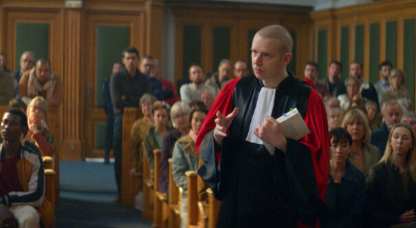
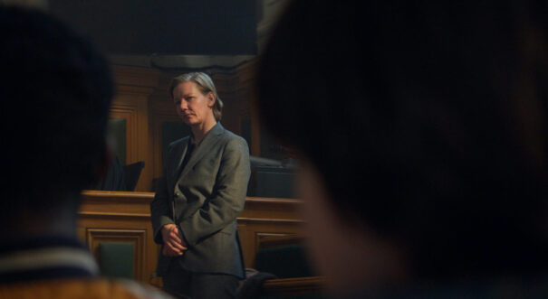
For the court scenes, the grade evolved as the hearing unfolds towards a heavier and more golden atmosphere. “It was important to accentuate the actors’ faces while maintaining the initial appearance of a slightly rough and textured visual, a palpable and living material,” reveals Léonard. “I liked the idea of allowing the images to express their best potential as the story unfolds.”
“During the grade, we went to the Max Linder cinema several times to watch the film in theatrical conditions, offering a perspective on the visuals and allowing me to make finer adjustments to the final look,” concludes Léonard. “For example, we noted through those screenings that some scenes would benefit from more saturation or contrast.”
Ti è piaciuto questo articolo?
Iscriviti al nostro Nutrire e non ti perderai nulla.


