

Autodesk renews its brand image
A new logo is the most significant visual change in the company's history in three decades.
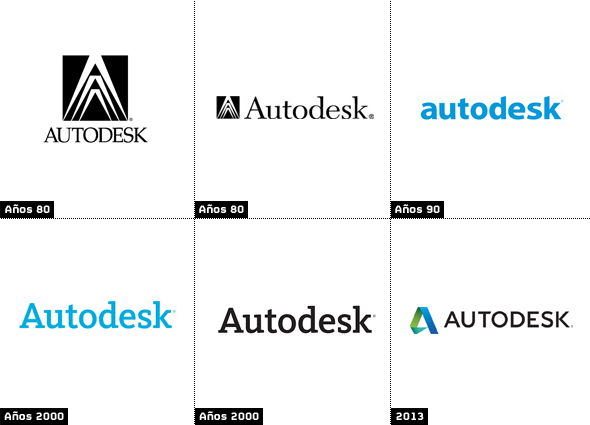
![]() With a radical change to its logo and new typography, Autodesk has renewed its brand image. The North American multinational incorporates for the first time an icon to the logo, which since its origin and in the different versions it has used in the brand name in different fonts.
With a radical change to its logo and new typography, Autodesk has renewed its brand image. The North American multinational incorporates for the first time an icon to the logo, which since its origin and in the different versions it has used in the brand name in different fonts.
Designed “in house” and presented within the framework of the TED Conferences, the new logo has been inspired by Origami (Japanese art that is the quintessence of origami) which represents the convergence between art and science, form and function.
The new identity reflects three-dimensional concepts and movement. The logo includes an 'A' symbol which is in line with the most recent trends in logo design, more volumetric, using gradients and curves juxtaposed with hard edges and corners.
Both the icon and the associated brand have a lighter palette than the previous identity, created in 2006. Likewise, the Autodesk design team has created different icons that simulate captures of elements in motion that identify the different areas and sectors to which its products are directed.
The new logo and its application is the most significant visual change in the company's 30-year history, although since 1982 subtle changes have been made to issues such as color and imagery: from the original clamp icon (a compass used to measure the distance between two opposite sides of an object) to the use of the Autodesk name. Our new visual identity includes a logo with the Autodesk name, for the first time in more than a decade.
Did you like this article?
Subscribe to our NEWSLETTER and you won't miss anything.
Related articles
 Mondo TV Studios renews its passion for animation under the Hi Animation brand
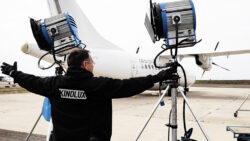 Kinolux transforms its brand image to consolidate its presence in Spanish fiction
 LaLiga+ improves usability, user experience and design following the new brand image
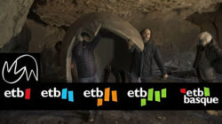 ETB renews its corporate image on the occasion of its 40th anniversary
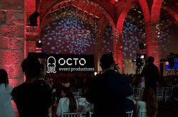 Visionarea Event Solutions changes its brand and image and will now be Octo Events Productions
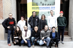 DocumentaMadrid turns 15 and renews its image
 Antena 3 renews its image
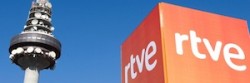 TVE renews image, programming and content management
 Panorama renews its graphic image
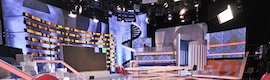 ‘Espejo Público’ renews set and image
 RTVE and Marca España will collaborate in promoting the country's image
 Antena 3 renews its image with fresh continuity
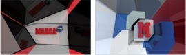 Zeligstudio designs the image of Marca Tv